My kids blow on soup to cool it down. Sometimes they blow like a tornado and most of the soup exits the spoon rather than entering the child. I always tell them to blow gently—it will cool just as fast.
Well, we put the theory to the test. For cleanliness, we simulated a broth soup with hot water. Viscous soups, like cream soups, might be different.
For apparatus we mounted a spoon in a third hand tool. A thermistor temperature sensor was affixed to have the sensor at the lowest point in the spoon’s bowl. We had a small hand-held anemometer to measure the air speed at the spoon. We transferred hot—nearly boiling—water into the spoon with the turkey baster. The data logger, my own design, recorded the temperature.
Each of three test subjects blew on the soup to cool it. Each person blew lightly or strongly. We attempted to calibrate the airspeed at the spoon during an exhale. The picture below shows the first test subject (Dear Daughter) measuring the air speed. The anemometer is aligned with the spoon. Each subject attempts to hold their head in the same position.
Each subject blew on the spoon until the thermistor reading fell below 30°C. We recorded the start time and the stop time as indicated by the data logger. The start and stop time became cut points in the data processing.
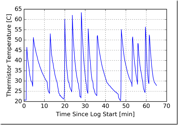
We did all the experiments over about an hour, and left the data logger running the whole time. The plot of temperature is shown next. The spikes correspond to times when we recharged the spoon with hot water. The drops at the bottom of each trough correspond to our evacuation of the remaining water from the spoon.
A cut portion of the timeline, corresponding to each experiment, is fitted to an exponential function of the form Temp = A×exp(time×B). The time constant for these fits is –1/B. The time constant corresponds to the amount of time for the temperature to drop 73% of the way to the ambient temperature.
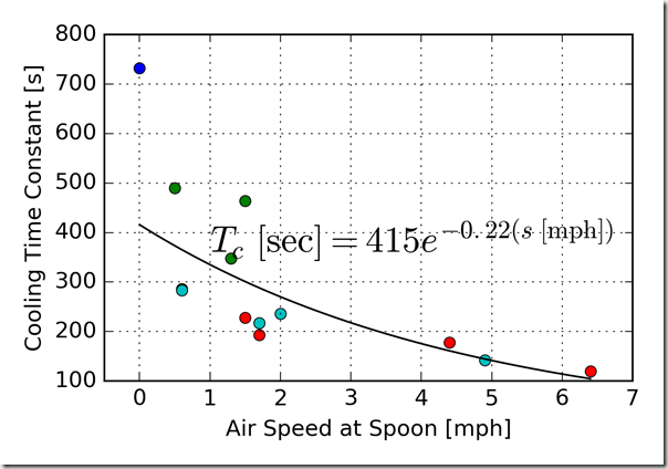
The time constants from each trial also describe a curve as a function of the air speed. I fitted these data with another exponential function, and although the fit is not exact, it is satisfying close to the data.
Each point color in the graph represents one person’s attempt. The dark blue point in the upper left is the a control where nobody blew on the spoon. The red point in the lower right corner corresponds to my son’s fastest effort, which removed about half the soup from the spoon.
To summarize the results, faster air speed does cool the soup considerably faster—meaning that I was not correct. My recommendation, based on the data, is to blow as fast as possible provided the soup is not sloshing out. You are welcome to use this data next time you’re trying to convince a young child to cool their soup properly. Your mileage may vary.


